Step by step guide to painting fruit still life
Introduction
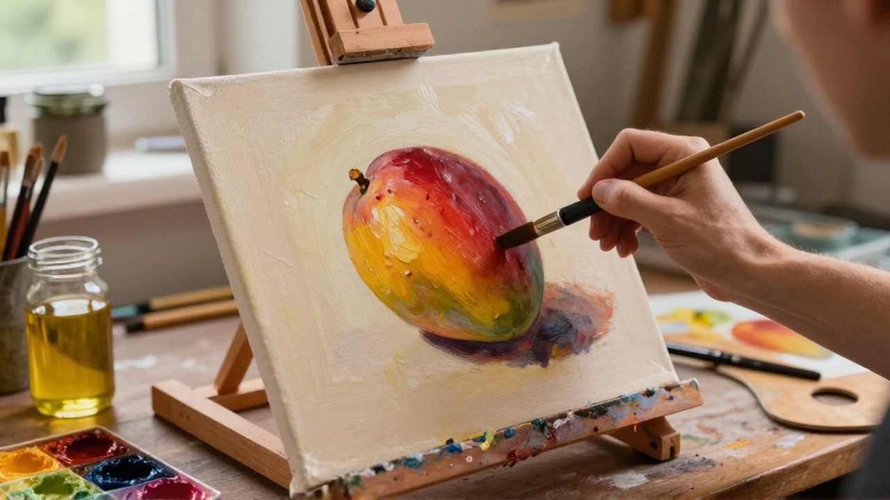
Fruit still life painting is a fundamental discipline in the visual arts, serving as an essential exercise for mastering light, shadow, color, and texture. By focusing on inanimate objects like citrus, grapes, or apples, artists can study the way light interacts with organic surfaces without the complexities of human anatomy or movement. This practice is ideal for both beginners learning foundational techniques and experienced painters looking to refine their ability to render three-dimensional forms on a two-dimensional surface.
Mastering this genre allows an artist to develop a controlled environment where every variable—from the angle of the sun to the placement of a shadow—can be manipulated. Understanding these principles is vital for anyone wishing to transition into more complex subjects, such as portraiture or landscape painting, as it builds the technical discipline required to perceive reality accurately.
Essential materials for fruit still life
Before beginning, you must gather tools that allow for both precision and blending. The choice of medium will dictate your workflow, but the core components remain similar across different styles.
- Surface: A primed canvas, canvas board, or heavy-weight watercolor paper is necessary to prevent warping and ensure paint adhesion.
- Paints: A versatile range of colors including primary colors (red, blue, yellow), plus white and black, or a pre-set set of fruit-toned hues like ochre, sienna, and cadmium red.
- Brushes: A variety of shapes is required. Round brushes are excellent for detail, while flat and filbert brushes are better for covering large areas and blending soft edges.
- Mediums and Solvents: Depending on whether you use oil or acrylic, you will need thinning agents or mediums to adjust the consistency and drying time.
- Lighting source: A single, strong light source is critical to create clear highlights and deep shadows.
Preparing the composition and setup
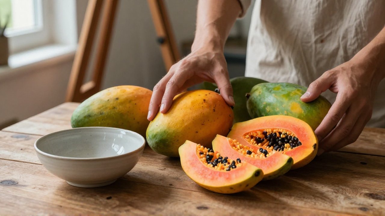
Setting the scene is as important as the painting itself. A successful still life begins with a thoughtful arrangement of subjects.
Select fruits that offer a variety of shapes, colors, and textures. For example, combining the smooth skin of an apple with the bumpy texture of a lemon or the translucency of grapes creates visual interest. Arrange them in a cluster, ensuring they overlap slightly to create depth. Placing them on a simple cloth or a wooden table provides a neutral background that does not distract from the main subject.
Once the objects are placed, position your light source to one side. This “side-lighting” creates a clear distinction between the lit side of the fruit and the shadowed side, which is essential for defining volume. Avoid using overhead room lights, as they tend to wash out shadows and flatten the appearance of the objects.
Sketching the basic shapes and proportions
The first step in the painting process is translating the physical objects onto the surface through a preliminary sketch. It is a mistake to start with details like the stem of a grape or the speckles on a pear. Instead, view the fruit as a collection of simple geometric forms.
An orange can be viewed as a sphere; a banana as a cylinder; a pear as a teardrop shape. Use a light touch with a pencil or a diluted wash of paint to map out these large shapes. Pay close attention to the “negative space”—the empty areas between the fruits—to ensure the composition is balanced. If one side of your canvas feels too heavy or crowded, adjust the placement of your objects before moving to the color stage.
| Phase | Focus | Common Goal |
|---|---|---|
| Mapping | Large silhouettes | Establishing composition |
| Proportion | Size relationships | Ensuring realism |
| Placement | Spacing | Creating depth and balance |
Applying base colors and midtones
Once the sketch is finalized, begin applying the base colors. This stage is often called “blocking in.” Use a thin layer of paint to fill in the general color areas of each fruit. Do not worry about fine details or perfect transitions at this point.
Work from the mid-tones outward. For a red apple, apply a medium red across the body of the fruit. Avoid using pure black for shadows or pure white for highlights immediately; instead, use a darker, desaturated version of the fruit’s color for the shaded areas. This technique, known as color temperature management, ensures that the shadows look natural and “warm” or “cool” rather than muddy.
Rendering light, shadow, and depth
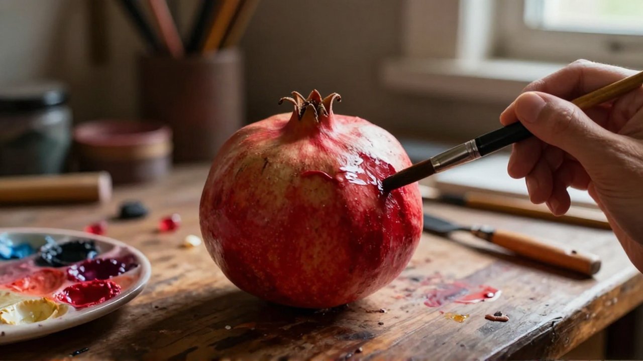
The transition from a flat shape to a three-dimensional object happens during the rendering of light and shadow. This is the most critical phase for achieving realism.
Identify the highlight, which is the brightest spot where the light hits the fruit directly. Next, observe the “core shadow,” which is the darkest part of the object itself, and the “reflected light,” which is a small amount of light that bounces from the table back onto the shadowed side of the fruit. Adding reflected light is a professional secret that prevents the fruit from looking like a flat silhouette.
Finally, do not forget the “cast shadow.” This is the shadow the fruit throws onto the table or the cloth beneath it. A cast shadow is usually darkest near the base of the object and becomes softer and lighter as it moves away.
Adding final details and textures
The final stage involves “polishing” the painting. This is where you add the specific characteristics that make a piece of fruit recognizable and appetizing.
Use a fine-tipped brush to add textures: the tiny pores on a citrus peel, the subtle glisten of a wet grape, or the slight imperfections and bruises on a pear. If you are working with oil paints, you can use thick applications (impasto) to create physical texture. If using watercolors, use light washes for softness. Limit these details to specific areas; if every single inch of the painting is highly detailed, the eye will not know where to rest, and the overall effect will feel cluttered.
Common mistakes to avoid
- Using pure black for shadows: This often makes the painting look “dirty.” Instead, mix your shadow colors using complementary colors (e.g., adding a bit of green to a red shadow).
- Ignoring edges: Beginners often make every edge too sharp. Real objects have “lost edges” where the shadow blends into the background.
- Overworking the paint: Continually brushing over the same area can lead to a muddy appearance. Once a color is placed, allow it to settle.
- Flat lighting: Using light from directly in front of the subject eliminates all shadows, making the fruit look like two-dimensional circles.
Frequently asked questions
How do I make fruit look shiny or matte? For shiny fruit, like an apple, use a very bright, sharp highlight with a small amount of white. For matte fruit, like a peach, use softer transitions between light and shadow and avoid sharp white highlights.
What is the best medium for beginners? Acrylics are often recommended for beginners because they dry quickly and allow for easy corrections. However, oils offer more time for blending, which can be helpful for realistic transitions.
Should I paint the background first or the fruit? It is generally more effective to paint the background and the base tones of the fruit simultaneously. This helps you see how the colors of the fruit interact with the environment, preventing a “cut-out” look where the fruit appears floating on top of the background.

Post Comment